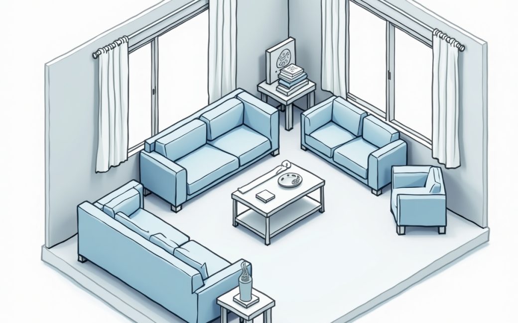
Small living room or oversized furniture
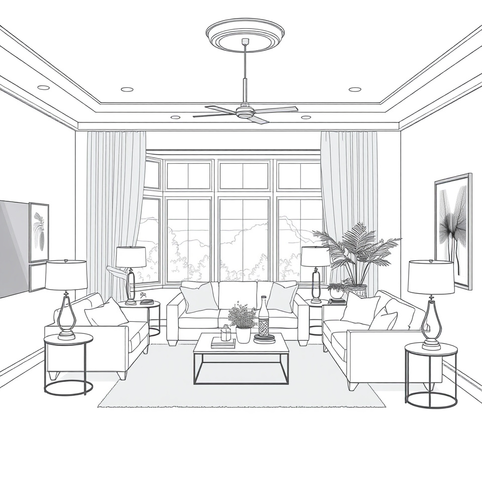
A living room that feels tight almost always has one of two causes: the furniture is scaled for a bigger box, or the walking paths through the room were never planned. Both are fixable without buying anything new, though a new sofa is sometimes the honest answer.
Room reads cramped and circulation is blocked
If you have to turn sideways to pass between the coffee table and the sofa, or a door won't open fully because a chair is in the way, the problem is circulation, not decor. Interior designers generally work to a minimum walking path of 30 to 36 inches through main routes in a room — enough for two people to pass without brushing furniture. Anything narrower reads as clutter even if the furniture itself is attractive.
Measure the room and doorways
Before moving a single piece, get real numbers: the length and width of the room, the location and swing of every door, and the position of any fixed features — a fireplace, a window seat, radiators. Note where the natural traffic line runs, meaning the straightest path between the two doorways people use most. Furniture should get out of that line, not sit in it.
Choose smaller-scale sofa, chair and side tables
A sectional bought for a great room will always fight a smaller box room, whatever colour it's upholstered in. In a tight living room, a two-seat or apartment-depth sofa, a slipper chair instead of a wing chair, and narrow side tables free up the clearances above without shrinking the seating count. Architectural Digest's small living room guidance leans on exactly this substitution — lower-profile, narrower-depth pieces in place of standard scale, rather than fewer pieces overall — as the fix that keeps a small room functional instead of sparse (see Architectural Digest's small living room ideas).
Re-plan the layout around clear walking routes
Once you know the traffic line and the minimum path width, draw the seating group around it rather than against the walls. A sofa floated a foot or two off the wall, with a walkway behind it, usually reads larger than the same sofa pushed flush to the perimeter, because the eye reads the gap as intentional space rather than as furniture that didn't fit.
Room feels dark or visually heavy
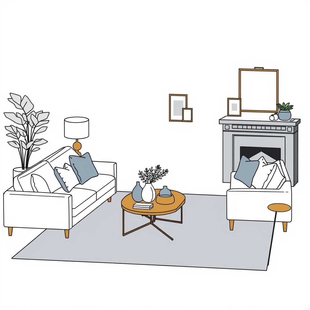
A dark-feeling living room is a lighting problem before it's a paint problem, and testing the wrong thing first is why so many repaints get repainted. Diagnose the light before you diagnose the colour.
Assess how much natural light the room receives
Note which direction the main window faces and how many hours of direct sun the room gets across a full day, not just at the time you happen to be standing in it. A north-facing room and a south-facing room will read the same paint chip completely differently, which is the single most common reason a colour that looked right in the shop looks wrong at home.
Test paint colour under that light
Farrow & Ball's living room colour guidance recommends viewing a colour at different times of day in the actual room before committing, specifically because artificial light sources and the angle of daylight both shift how a pigment reads on the wall (Farrow & Ball, living room colour ideas). Paint a sample patch at least a foot square on two different walls — one that gets direct light and one that doesn't — and check it morning, midday and evening before buying enough for the whole room.
Apply lighter tones or a considered darker scheme with layered artificial lighting
A room with genuinely low natural light usually benefits from higher-reflectance, warmer whites or soft neutrals rather than a stark cool white, which can read flat and grey without sun to bounce off it. Alternatively, a low-light room can go the other way entirely — a deliberately dark, saturated colour paired with layered lamps reads as intentional and moody rather than gloomy, provided the lighting plan compensates. Either route depends on treating light as three separate layers — ambient, task and accent — rather than one central ceiling fixture, since a single overhead source is what makes a room feel flat and heavy regardless of wall colour.
Scheme looks incoherent or scattered
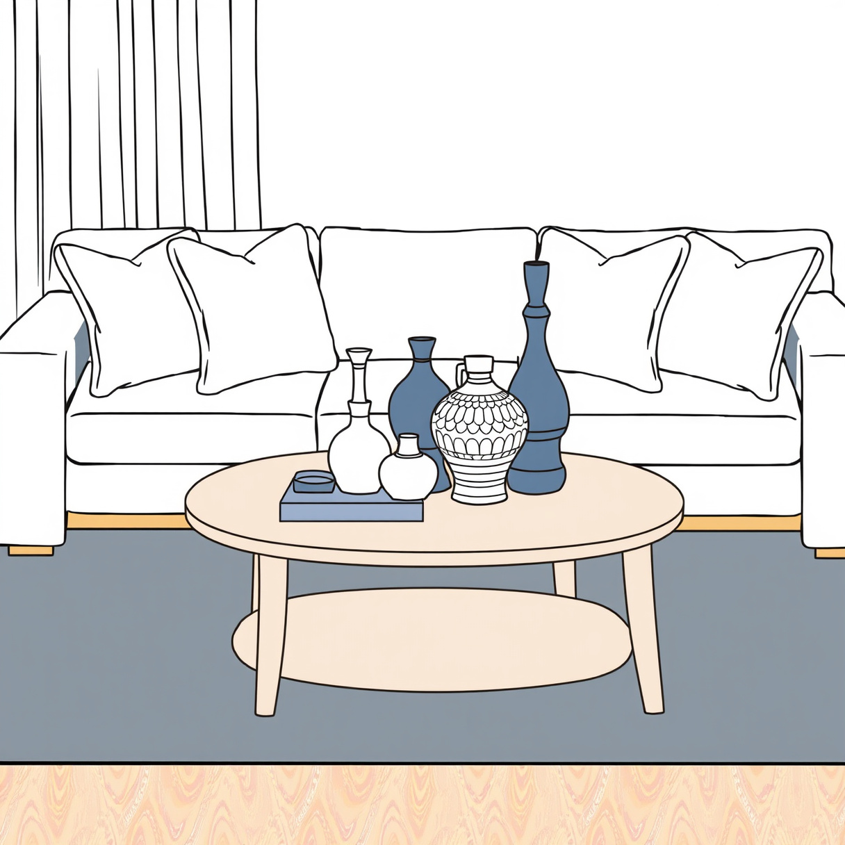
If a living room has good furniture, decent light, and still doesn't hold together, the fault is usually distribution: too many competing colours with no dominant one, and objects placed without any grouping logic. Both have named, specific fixes.
Diagnose it as too many competing colours and ungrouped objects
Walk the room and count the colours actively competing for attention — wall colour, sofa, rug, curtains, art, accessories. If more than three or four are all fighting at similar visual weight, none of them reads as intentional. Separately, look at any surface with objects on it: a coffee table or mantel with an even number of same-height items, spaced evenly, reads static and slightly institutional, which is a different problem from too much colour but produces the same "scattered" feeling.
Apply 60-30-10 to fix colour proportions across walls, upholstery and accents
The 60-30-10 rule assigns 60% of a room's visible colour to a dominant tone — typically the walls and largest upholstered piece — 30% to a secondary colour, often the sofa or curtains if they differ from the walls, and the remaining 10% to accent colour in cushions, art, or small objects. In a living room this usually plays out as neutral walls and a large sofa carrying the 60%, a rug or armchair carrying the 30%, and cushions or a vase carrying the 10%. The value of the ratio isn't precision — nobody is measuring square inches — it's that it stops every element from being treated as equally important, which is the actual cause of a scattered-looking room.
Group accessories in odd numbers (3-5-7) on the coffee table and shelves
The 3-5-7 rule is a vignette-grouping habit, not a room-planning rule: arrange decorative objects in odd-numbered clusters of three, five or seven, at varying heights, rather than in pairs or evenly spaced rows. An odd number forces asymmetry, and asymmetry is what the eye reads as arranged rather than lined up. On a coffee table, that might be a stack of two books, a small vase set on top of them, and one object beside — three elements at three different heights, grouped, rather than a book, a candle and a coaster spaced equally apart. The same logic applies to a shelf or mantel: cluster in odds, vary height, and leave uneven negative space between groups rather than distributing objects evenly across the whole surface.
| Rule | What it governs | Rough split or grouping | Where it applies in a living room |
|---|---|---|---|
| 60-30-10 | Colour proportion | 60% dominant / 30% secondary / 10% accent | Walls + large sofa, rug or chair, cushions/art |
| 3-5-7 | Object grouping | Clusters of 3, 5 or 7, varied height | Coffee table, mantel, shelving vignettes |
Sofa
The sofa is the anchor the rest of the layout is built around, and its size should be decided before its colour or fabric. Its depth and length determine how much clearance is left for a coffee table, a walking path, and any side tables, so measuring the sofa footprint against the room footprint comes first, not last.
A common working distance is 14 to 18 inches between the front of the sofa and the coffee table — close enough to reach a drink without leaning, far enough to leave knee room and a place for feet. If a sectional or long three-seat sofa doesn't leave that gap once a coffee table and a walking path are accounted for, the sofa is the wrong scale for the room, not the table.
Orientation matters as much as size. A sofa that floats away from the wall, with a walkway kept clear behind it, tends to make a mid-size room feel more resolved than the same sofa pushed against the wall — the emeriti of most professional layout advice is that the seating group should face inward toward a shared focal point (a fireplace, a TV wall, a window) rather than being arranged around the room's perimeter, since a perimeter arrangement forces conversation across the widest possible distance.
Side table
A side table's job is narrow and specific: hold a lamp, a drink, and reachable storage, at a height close to the arm of the sofa or chair it sits beside. Most work well within an inch or two of the adjacent seat's arm height, since a table noticeably taller or shorter than the arm makes reaching for a glass awkward.
Every seat that's meant to be used for reading or evening sitting needs a surface within arm's reach — that's the practical argument for a side table at each end of a sofa rather than one shared table for a three-seat piece. In a small living room this is the item most often cut for space, but a slim console-width table (12 to 16 inches) at just one end preserves the function without eating the clearance a full-depth table would.
Coffee table
The coffee table sits at the centre of the main seating group and should be sized against the sofa in front of it, not chosen independently. A commonly used guideline sets the coffee table height at or 1 to 2 inches below the seat height of the adjacent sofa, so a drink or a foot resting on it doesn't sit above knee level.
Length is the second variable: a coffee table roughly two-thirds the length of the sofa it faces tends to look proportioned rather than either lost in front of a large sectional or overwhelming a loveseat. Combined with the 14–18 inch clearance to the sofa mentioned above, this gives a usable sequence for picking a table: measure the sofa length and seat height first, then shop within those two constraints rather than picking a table on shape or finish alone.
Room layout
Furniture layout in a living room is best decided in an order, not all at once, because each decision constrains the next one.
- Mark the traffic path. Identify the doorways used most and the straight line between them; this line needs to stay at or above the 30–36 inch clearance mentioned earlier and should not run through the seating group.
- Place the anchor piece. Decide what the room faces — a fireplace, a media wall, a window — and position the sofa relative to it before anything else.
- Set the seating distance. Position any chairs or a second sofa so all seats are within a comfortable conversational distance of each other, generally close enough that people don't have to raise their voices across the gap.
- Add the coffee table. Slot it into the 14–18 inch gap in front of the sofa, sized against the sofa length as above.
- Layer the lighting. Add ambient, task and accent light sources once furniture positions are fixed, since lamp placement depends on where the side tables ended up.
- Bring in textiles last. Rug, cushions and throws come after the furniture footprint is settled, not before, since rug size depends on the final seating layout.
A rug sized for the room, not just for the floor visible around furniture, is what makes this sequence read as intentional: at minimum, the front legs of every seating piece in the group should sit on the rug, which usually rules out the smaller rug sizes retailers stock as a room's "starter" option.
Scale and proportion
Scale and proportion are the underlying reason the rules above work at all — they are two separate checks, and a room can fail either one independently of the other.
Scale compares furniture size to the room's size: a deep sectional in a room with an 11-foot wall will always look oversized however well it's styled, because the ratio of furniture footprint to floor area is off before decor enters into it. Proportion compares pieces to each other within the room: a tall, narrow sofa paired with a very low, wide coffee table can be individually well-scaled to the room and still look mismatched next to each other.
The 60-30-10 and 3-5-7 rules, along with the sofa-to-coffee-table ratios above, are really proportion tools — they govern how pieces relate to one another once the overall scale has already been set correctly by the measuring step described in the small living room section. Getting the room's scale right first, then the proportions between pieces, is the order that avoids re-buying furniture twice.
Cramped, cluttered feeling
A cramped feeling and a genuinely small room are not always the same thing — a large room with poor circulation can feel just as tight as a small one furnished correctly. The tell is whether the discomfort is about floor space or about movement: if you can walk through the room freely but it still feels crowded, the cause is usually visual (too many competing colours, ungrouped objects, uneven negative space) rather than physical. If movement itself is restricted, it's a genuine clearance problem and the fix is the measuring and re-layout sequence covered earlier.
Emily Henderson's living room advice draws a similar line, arguing that a room reads better when it's edited down to fewer, better-scaled pieces with intentional negative space left between them, rather than filled to its physical capacity (Style by Emily Henderson, how to make your living room look better). Negative space isn't wasted space in a small room — it's what signals that the furniture present was chosen deliberately, rather than being whatever fit.
Once the circulation and visual causes are separated, the fix is nearly always cheaper than a full replacement: rearranging existing furniture along a traffic line costs nothing, repainting to correct a proportion problem is a weekend and a can of paint, and only a genuine scale mismatch — a sofa too large for the room's footprint — requires actually replacing the anchor piece. Start with the free fix before the expensive one, and measure before buying either way.