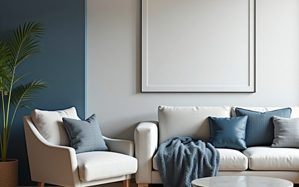
Room reads flat and impersonal
A room that photographs fine but feels dull in person almost always has one problem: every surface is doing the same job in the same finish. Painted drywall, a smooth sofa, a flat-weave rug and a laminate table all reflect light the same way, so the eye has nothing to catch on.
The fix is tactile contrast rather than more furniture. Pairing a matte plaster wall with a boucle chair, a rough jute runner and a polished stone side table gives the same room three or four different light responses instead of one. Texture is the lever that most of the current trend coverage keeps returning to as the difference between a styled room and a finished one — it shows up as the throughline across nearly every list of what's changing for 2026.
Before buying anything new, audit a room surface by surface:
- Walls: one finish, or a mix of paint, plaster, wood and tile?
- Seating: all smooth upholstery, or at least one nubby, woven, or napped piece?
- Floor: hard surface softened by a textured rug, or left bare?
- Tabletops: any variation in stone, wood grain or metal, or is it all one material?
Where three or more of those answers are "one finish," that's the diagnosis, and it's fixable with a rug, a throw and a lamp before it's fixable with a renovation.
Minimalism leaves rooms feeling cold or unfinished
A minimalist room that feels unfinished usually isn't missing furniture — it's missing layers. Stripped-back schemes rely on a handful of large, unbroken surfaces to read as calm rather than empty, and that only works when proportions, lighting and material quality are already close to right. When they aren't, the same room just reads cold.
Design coverage is shifting away from pure minimalism toward layering — treated as the successor style rather than a return to maximalism — with objects, textiles and mixed materials built up in a single scheme rather than edited down to one or two pieces per surface, as several pages tracking the coming year's shift describe it.
Layering keeps a room from going cluttered by working in groups rather than scatter:
- Group objects in threes on a shelf or console rather than spacing single items evenly.
- Stack textiles by weight — a flat-weave base, a mid-weight throw, one textured cushion — rather than adding one of each category everywhere.
- Repeat a material (the same wood tone, the same brass) across two or three pieces so the eye reads the room as curated rather than mixed at random.
The ceiling on layering is the same one that defines clutter in the first place: a surface that needs clearing before it can be used stops being a layered surface and becomes a pile. If a side table can't hold a drink without moving three objects first, the layering has gone past its limit.
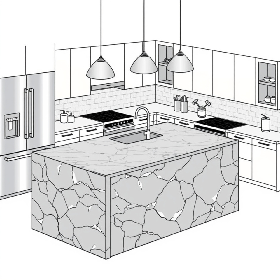
Hard-working surfaces like kitchen walls and islands dominate the eye
A kitchen's biggest surfaces set the tone for the whole room, so they're the place to spend material budget first, not last. An island face or a full-height backsplash is visible from every angle of the room, which means its material decides what every other finish has to sit alongside.
Natural stone on an island or a kitchen wall is one of the choices named as the anchor for what's being called a "New Rustic" direction — rougher, more varied stone replacing the uniform engineered surfaces that defined the previous decade of kitchens — in Good Housekeeping's roundup of the coming year's shifts.
Once that stone is chosen, the rest of the kitchen's finishes are selected to echo it rather than compete with it — cabinetry in a tone pulled from the stone's veining, metal fixtures matched to its undertone, flooring kept quiet enough not to fight for attention. That's the practical order of operations: pick the dominant surface, then work outward from it, rather than choosing twelve finishes independently and hoping they agree.
Interior design
Interior design is the practice of planning how a space's layout, materials, lighting and furnishings work together — structural and durable decisions, not just the objects placed inside a finished room. It covers floor plans, built-ins, plumbing and lighting layout as much as paint and furniture, which is what separates it from decorating in scope rather than skill.
For a reader starting from a blank room with no plan yet, the practical order is usually:
- Fix the layout and traffic path first — furniture placement and clearances, before any finish is chosen.
- Decide the one dominant hard surface (a floor, an island, a feature wall) and commit to its material.
- Choose wall treatments and paint to sit alongside that material, not before it.
- Layer in textiles, lighting and smaller objects last, once the fixed elements are settled.
Doing this in reverse — buying textiles and accessories before the layout and the dominant surface are fixed — is the most common reason a reader ends up with a room that doesn't cohere despite spending on individual pieces that look fine alone.
Texture
Texture is the surface quality that makes a material feel rough, smooth, woven, matte or reflective, and it's the single element that appears across nearly every current description of what makes a room feel finished rather than staged. Flat finishes read as temporary; varied ones read as considered, which is why so much current advice treats texture as a fix rather than a style choice.
Practically, texture gets built in three places: hard surfaces (stone, plaster, reclaimed wood), soft surfaces (woven rugs, boucle and linen upholstery, heavy-weight curtains) and finishes (matte paint against a glossy accent, brushed metal against polished). A room only needs contrast in two of those three categories to stop reading as flat — it doesn't require a full renovation to add the third.
Interior designer
An interior designer and an interior decorator are often used interchangeably, but the distinction matters for anyone deciding who to hire. A designer typically works on structural and spatial decisions — floor plans, built-ins, lighting layout, material specification for permanent surfaces — and in many places that work intersects with licensing and code compliance. A decorator focuses on the finishing layer: furniture, paint, textiles and accessories within a space whose structure is already set.
For a reader with a blank-slate home needing walls moved or a kitchen reconfigured, that's a designer's scope. For a reader with a sound layout who wants the room to look and feel different, a decorator — or a confident reader following the layering and texture principles above — can usually get there without touching the structure at all. Knowing which one a project needs before calling anyone is the step that keeps a renovation budget from being spent on the wrong kind of help.
Interior design trends
Year-cycled trends move fastest in paint and soft furnishings and slowest in layout and fixed materials, which is why it's worth separating what will look dated in three years from what won't before spending on either. A dramatic accent wall or a very specific trend color is cheap to repaint when it falls out of favor; a stone island or a structural layout change is not.
A few of the recurring threads worth knowing by name:
- Color moving away from all-grey schemes toward warmer neutrals and deeper, more saturated tones — a shift noted across multiple trend pages tracking the move beyond the grey-dominated decade that preceded it, including coverage of what's replacing cool neutrals going into 2026.
- The 3-5-7 rule, a styling guideline for grouping decorative objects: arrange items in odd numbers — three, five or seven pieces — of varying height on a shelf, mantel or console, because odd-numbered, uneven-height groupings read as more natural and less staged to the eye than even, matched pairs. It's a vignette rule, not a furniture-layout rule, and it applies to the small-object layering described above, not to how many chairs sit around a table.
- Durability by category: paint colors and accent textiles are the cheapest and fastest to update when a look dates; stone, tile and cabinetry are the most expensive to undo, which is why the dominant-surface decisions in a kitchen deserve more deliberation than the cushion covers.
If a reader wants a color that reads as expensive rather than trendy, the consistent advice across current coverage is depth and saturation over the flat, high-LRV neutrals that dominated earlier grey-driven schemes — darker greens, warm terracottas and ink tones used confidently on walls or cabinetry rather than as a single accent.
Layering
Layering, as distinct from clutter, is the deliberate stacking of textiles, finishes and objects so that a room has visual depth without losing a sense of order. It's the direct response to minimalism's cold-room problem described above, and it's treated across current coverage as the direction replacing stripped-back schemes going into the next design cycle.
The test for whether a room has been layered correctly rather than overfilled is functional: every surface should still be usable without rearranging it first, and every grouping should read as one idea (a collection, a material, a color family) rather than several unrelated ones competing for attention.
Natural stone
Natural stone — marble, travertine, limestone, soapstone — is being used on kitchen islands, backsplashes and even full accent walls as the anchor material in current builds, prized for the variation and veining that engineered quartz was designed to eliminate. That variation is exactly what gives a kitchen the "New Rustic" character described earlier: no two slabs are identical, so the room reads as material-driven rather than finish-driven.
The tradeoff is permanence and cost: stone is among the most expensive finishes to replace, which is why it belongs at the start of a material decision rather than the end — chosen first, with everything else selected to complement it.
Wall treatment
Walls are where texture and material decisions are most visible, because they're the largest unbroken surface in most rooms. A plain painted wall is the default; moving beyond it — plaster, limewash, wood paneling, stone cladding, or a mix of matte and gloss paint on the same wall — is one of the fastest ways to add the tactile contrast that a flat room is missing, without touching layout or furniture at all.
Start with one wall, not four: pick the surface a room's traffic path or sightline hits first, test the finish there, and let the rest of the room's materials respond to it before committing further.