
What an interior designer does, and what the work pays
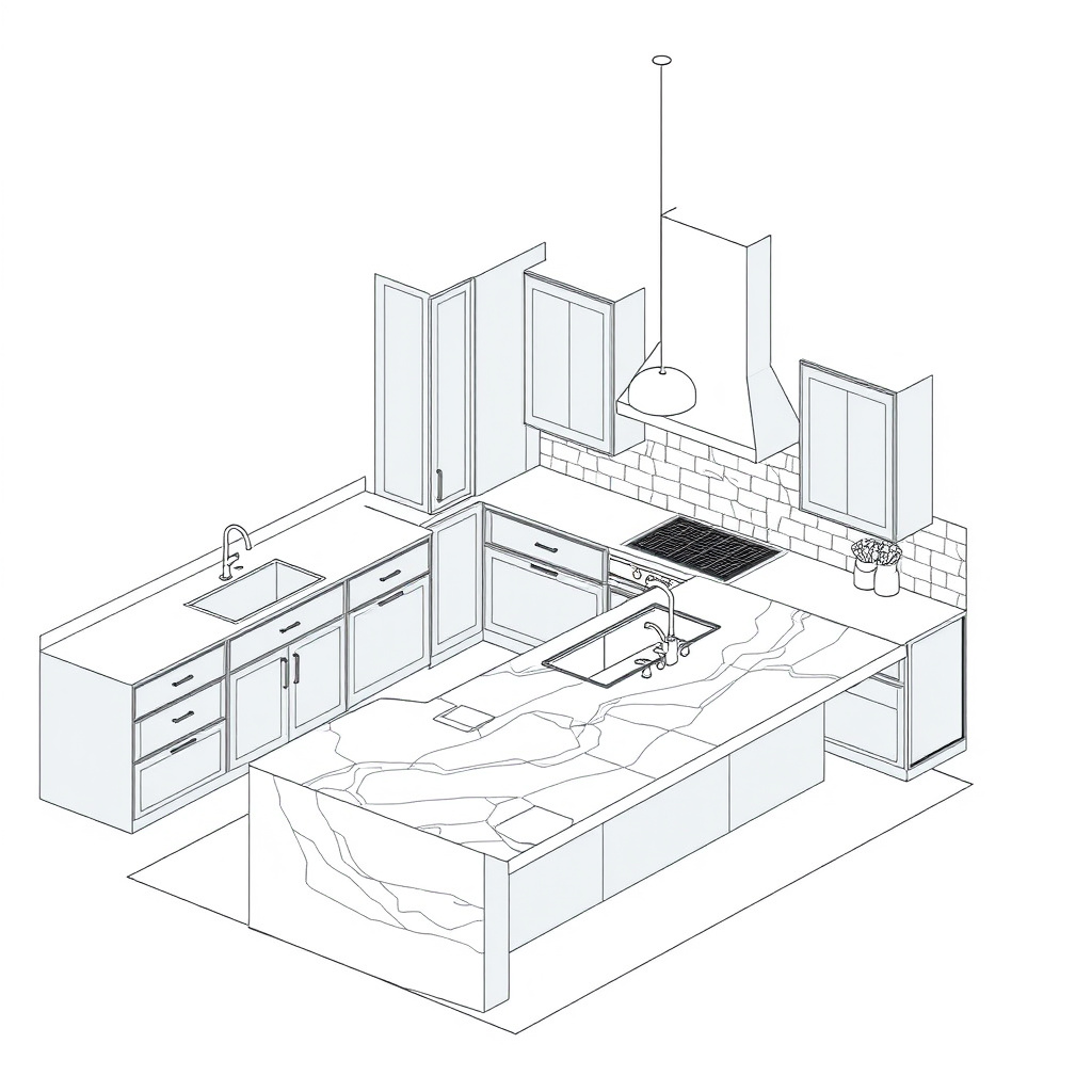
An interior designer specifies the materials, layout, lighting and furnishings of a built space and is typically trained in space planning, building codes and construction documentation — the difference between that and decorating, which deals only with surface finishes and furnishings inside walls that already exist. A decorator chooses a sofa, a rug and a paint colour; a designer also decides where a wall moves, how a kitchen island is plumbed, and whether a sightline from the entry works at all. The two titles get used loosely, but the scope of work is the real distinction: if the project touches structure, electrical runs or a permit application, it has crossed from decorating into design.
Pay follows that scope. An entry-level designer working under supervision on drafting, sourcing and vendor coordination earns at the bottom of the range for the field; a senior designer who runs client relationships and full project budgets sits well above that; and a principal — someone with equity or ownership in the firm, carrying business development and final design authority — commands the top of it. Firm type changes the curve as well: a solo residential practice, a mid-size commercial studio and a hospitality-focused firm each price experience differently, and geographic market has at least as much effect as title does. Rather than quote a single national figure that flattens all of that variation, it is more useful to think in bands tied to responsibility:
- Entry / junior designer — drafting, material boards, vendor follow-up, supervised client contact.
- Mid-level / project designer — owns a project from concept through installation, manages a budget, supervises junior staff.
- Senior designer — runs multiple projects or a specialty (kitchens, hospitality, workplace), mentors others, contributes to business development.
- Principal / partner — sets studio direction, holds client relationships at the top of the account, often has ownership stake.
Anyone pricing a project or a hire should ask where in that progression a candidate sits, not just what their job title says — titles are inconsistent across firms, but scope of responsibility is not.
Interior design itself, at its root, is the practice of shaping the materials, layout and atmosphere of an indoor space so it functions for the people using it and reads a particular way to anyone walking in. Everything below is a version of that same practice applied to a specific symptom a room is showing.
Room reads flat and impersonal
A room that reads flat almost always has one surface problem: every finish in it shares the same texture. Smooth paint, smooth upholstery, a smooth rug and matte cabinetry in the same tone give the eye nothing to catch on, which is why a room can be fully furnished and still feel unfinished. Interior design ideas coverage points to texture as the main lever for correcting this — mixing natural stone, varied wall treatments and tactile textiles within one scheme rather than relying on more furniture or more colour to fix it.
The fix costs nothing structural: it is a swap of finishes, not an addition of volume. Practical places to introduce contrast, roughly in order of effort:
- Textiles — a woven or bouclé throw against a smooth sofa, a chunky-knit pillow against leather.
- Wall treatment — limewash, grasscloth or plaster finish on one wall where paint currently sits flat.
- A single stone or wood accent — a side table, a tray, a lamp base in a material that reflects light differently than the surrounding surfaces.
- Layered rugs — a flatweave under a smaller textured rug, rather than one rug alone.
A related shorthand worth knowing when grouping any of these: arrange objects, art or accessories in odd numbers — commonly three, five or seven pieces — since odd groupings read as intentional rather than accidental to the eye, which is the basic logic behind most "rule of three" styling advice applied to shelves, vignettes and wall arrangements. It is a grouping convention, not a law, and it breaks down past a certain density — at which point grouping by height and visual weight matters more than the count.
Once surfaces vary in texture, the same furniture and the same floor plan read as considered rather than generic, which is the character the texture-forward coverage is really describing.
Minimalism leaves rooms feeling cold or unfinished
Minimalism fails when it strips a room past the point of warmth, leaving hard surfaces, sparse furniture and no sense of who lives there. Current coverage of residential interiors describes a shift away from that pared-back approach and toward deliberate layering — building up textiles, objects and mixed materials in a single room rather than removing them. Reporting on the trend frames this as a direct response to rooms that read as cold or unfinished once the minimalist phase went too far, with designers quoted advocating for collected objects and varied materials over a single matched set.
Layering without it reading as clutter comes down to grouping and restraint on colour, not restraint on quantity:
| Approach | What it looks like | Risk if unmanaged |
|---|---|---|
| Minimalism | Few objects, matched materials, negative space | Reads cold, impersonal |
| Layering | Mixed textiles, grouped objects, varied materials in one palette | Reads cluttered if colours don't agree |
| Layering, controlled | Mixed materials held to two or three tones, objects grouped rather than scattered | Reads collected and intentional |
The practical limit is the palette, not the object count: a room can hold a wool throw, a ceramic vase, a brass tray and a linen cushion without reading as busy, provided they sit within a narrow colour range and are grouped rather than spread evenly around the room. Spread the same objects singly across every surface and the room reads cluttered regardless of how few pieces are in it. The discipline, in other words, moves from "how much" to "how matched."
Hard-working surfaces like kitchen walls and islands dominate the eye
A kitchen island or a feature wall dominates a room's sightline before anything else in it is noticed, which makes that surface the one to decide first, not last. A recent profile of a California residence built around this logic — described as a "New Rustic" scheme by designer Jay Jeffers — shows natural stone chosen for the kitchen walls and island first, with the surrounding cabinetry, flooring and fixtures selected afterward to echo that stone's tone and veining rather than compete with it.
That sequencing is the useful takeaway for anyone starting a room with no existing palette: pick the largest, most permanent surface first — stone, a dominant wall finish, a floor material — and let every other material decision answer to it, rather than choosing furniture and accessories first and hoping a cohesive look assembles itself. Working in that order also answers the budget question most projects face: spend first on the surface that cannot be easily changed later (stone, tile, a structural wall finish), and treat furniture, textiles and lighting as the layer that can be adjusted or replaced as budget allows.
On colour specifically, the same logic holds: a scheme built around one dominant neutral material — a warm limestone, a pale travertine, a soft greige — and repeated in two or three supporting tones generally reads as more considered, and more expensive, than a room where several unrelated colours compete for attention. The cost isn't in the paint can; it's in the restraint of keeping the palette narrow enough that the stone, the walls and the textiles all look like decisions made together rather than in sequence.
Pick the dominant surface before buying anything else for the room, and let that one material set every tone that follows.